Looking at Distributions

Sociology 312/412/512, University of Oregon

Aaron Gullickson

What is a Distribution?

The concept of a distribution

When we refer to the distribution of a variable, we are referring to how the different values of that variable are distributed across the given observations.

Look at it

  • We can make a plot that shows the distribution.
  • We make different kinds of plots for categorical and quantitative variables.
    • Barplots for categorical variables
    • Histograms for quantitative variables

Measure it

  • We can calculate summary measures of the center and spread of the distribution.
  • We an only calculate summary measures for quantitative variables.

Calculating frequencies

In order to display the distribution of a categorical variable, we first need to calculate the frequency which is the number of observations that belong to each possible category. We can do this easily in R with the table command:

table(politics$party)

   Democrat  Republican Independent       Other 
       1472        1236        1381         148 

Lets convert these frequencies into proportions by dividing through by the total number of observations. We can also do this easily in R by adding the sum command to the previous command:

prop <- table(politics$party)/sum(table(politics$party))
prop

   Democrat  Republican Independent       Other 
 0.34741562  0.29171584  0.32593816  0.03493038 

Proportions and percents

R also has a built-in function called prop.table that will calculate proportions automatically. We just need to feed the output of the table command into it.

prop.table(table(politics$party))

   Democrat  Republican Independent       Other 
 0.34741562  0.29171584  0.32593816  0.03493038 

We can employ this “wrapping” feature of R to do some more tidying up. In this case, I want to round the number of digits and multiply by 100 to turn my proportions into percents. I also use the sort command to sort values from highest to lowest.
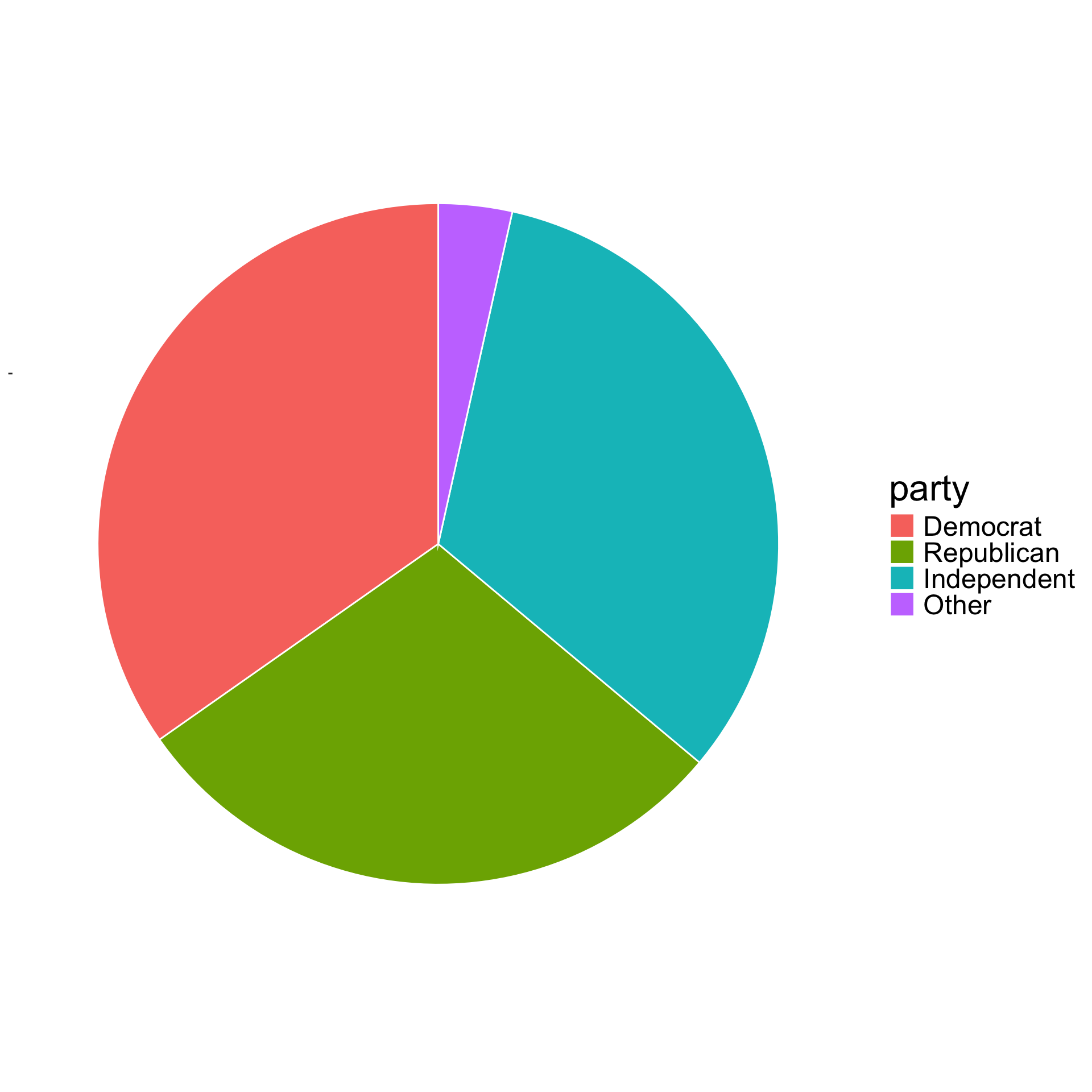
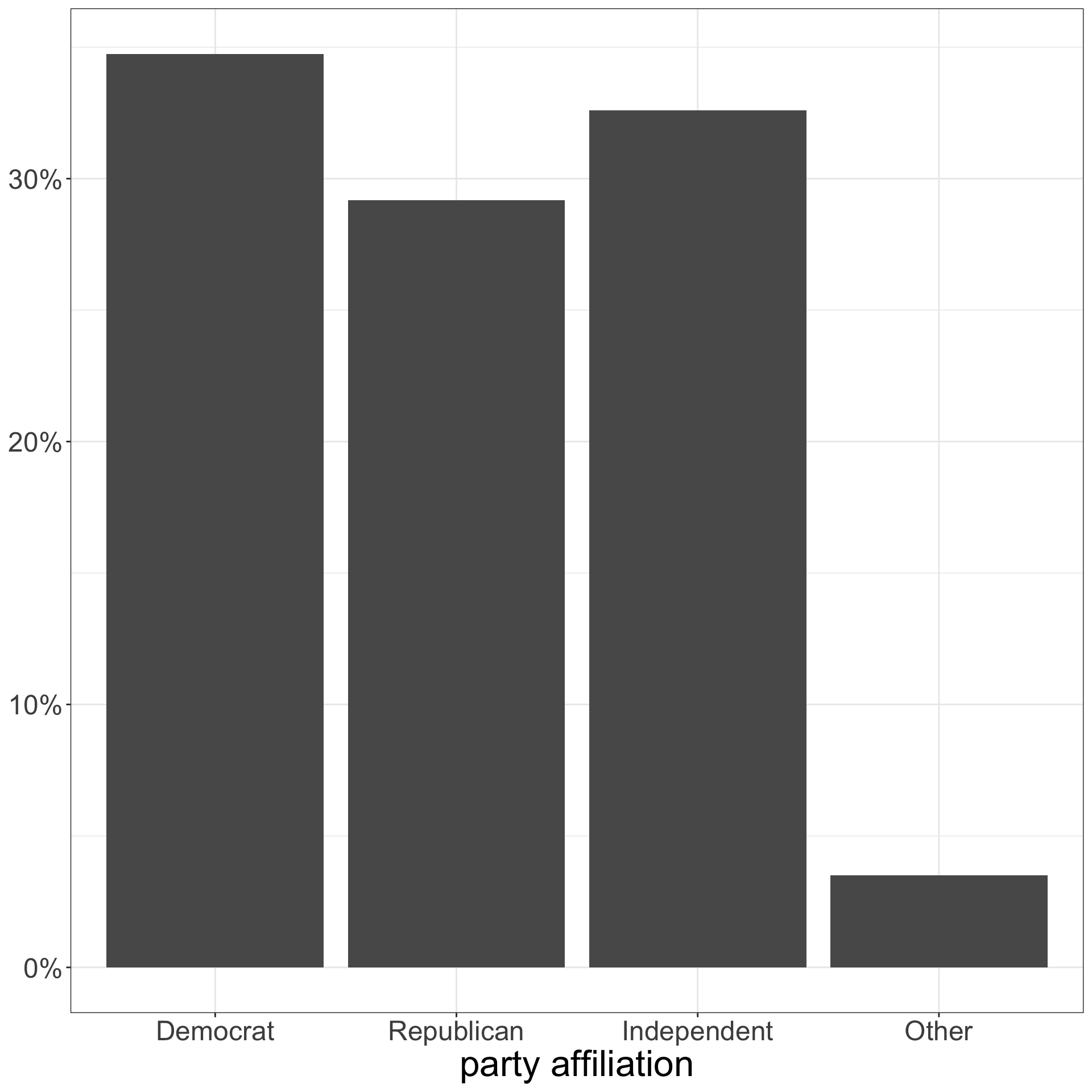
percent <- sort(round(100*prop.table(table(politics$party)),1), decreasing=TRUE)
percent

   Democrat Independent  Republican       Other 
       34.7        32.6        29.2         3.5 

How can we plot the percent?

Don’t use a piechart

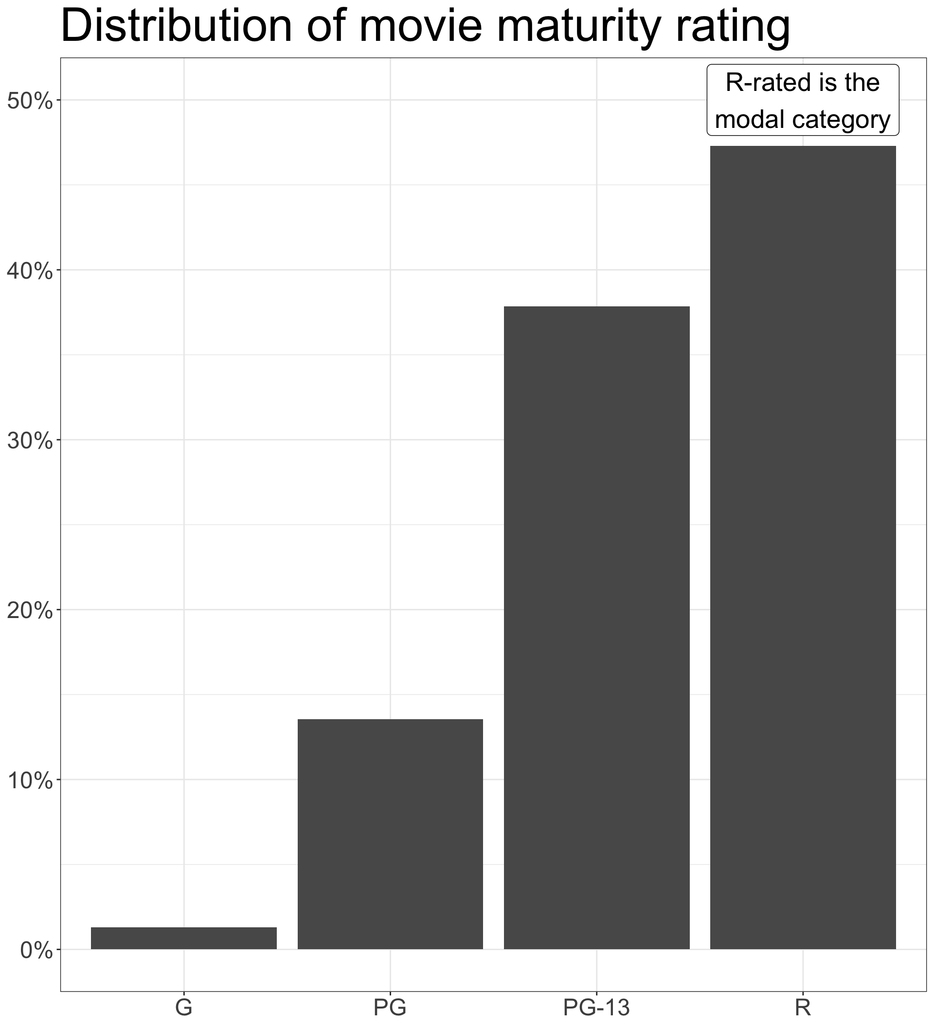
Use a barplot

Constructing a barplot using ggplot

We will use ggplot to construct graphs.

In a ggplot, multiple commands are linked together with + signs.

ggplot(politics, aes(x=party, y=after_stat(prop), group=1))+
  geom_bar()+                                                 
  scale_y_continuous(label=scales::percent)+.                 
  labs(x="party affiliation", y=NULL)+                        
  theme_bw()                                                  

The first command of ggplot takes two arguments. The first argument is the data we want to use (in this case, the politics dataset). The second argument is the aes command that defines aesthetics for the full plot.

The second command is geom_bar.All plots require some kind of “geometry” command which in this case makes bars.

scale_y_continuous(label=scales::percent) causes my proportions on the y-axis to be reported as percents.

The labs command can be used to add nice labeling of axes and to create titles and captions.

theme_bw defines a theme for the overall plot. I prefer theme_bw to the default theme in ggplot.
Code and output

ggplot(politics, aes(x=party, y=after_stat(prop), group=1))+
  geom_bar()+
  scale_y_continuous(label=scales::percent)+
  labs(x="party affiliation", y=NULL)+
  theme_bw()

Visualize quantitative variables with a histogram

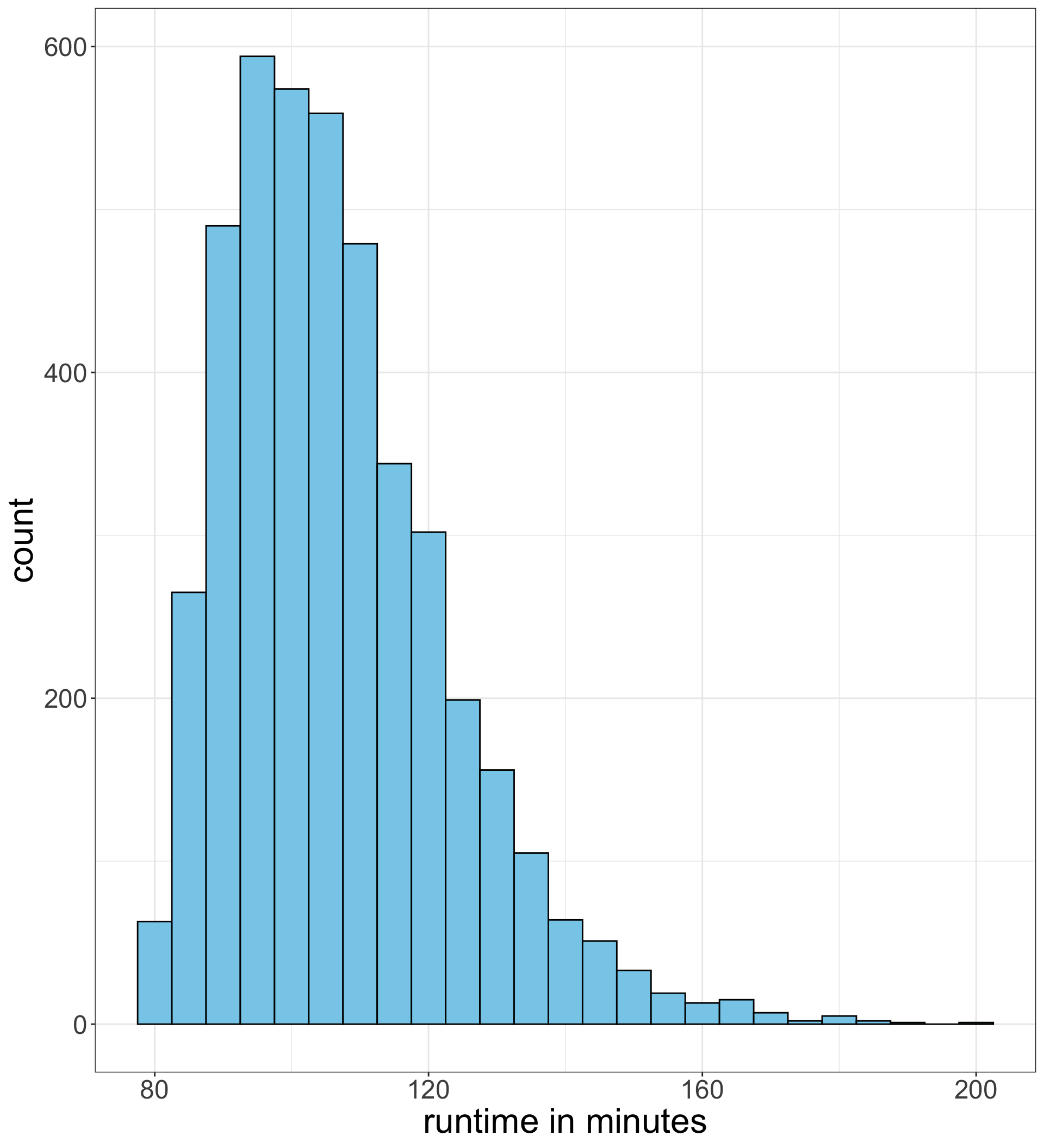
How a histogram is created

  1. We break the variable into equivalent intervals called bins. For a histogram of movie runtime length, we might use bins of 5 minutes width, so our bins would look like 90-94 minutes, 95-99 minutes, 100-104 minutes, 105-109 minutes, etc.
  2. We calculate the frequency of observations that fall into each bin. Technically, we need to decide which bin to put cases that straddle two bins (e.g. exactly 5 minutes). R defaults to putting these cases in the lower category.
  3. We make a barplot of these frequencies, but we put no space between the bars.

Code and output for making a histogram

ggplot(movies, aes(x=runtime))+
  geom_histogram(binwidth=5,
                 fill="skyblue", color="black")+
  labs(x="runtime in minutes")

Assign your variable to the x aesthetic.

Use binwidth to specify the width of the bins.

You can use fill and color to specify the fill and border color respectively for your bars.

What are we looking for in a histogram?

Shape
Is it symmetric or skewed?
Center
Where is the center or peak of the distribution and is there only one?
Spread
How spread out are the values around the center?
Outliers
Are there any observations that have relatively very high or low values?

The Center of a Distribution

What does “center” mean?

Mean

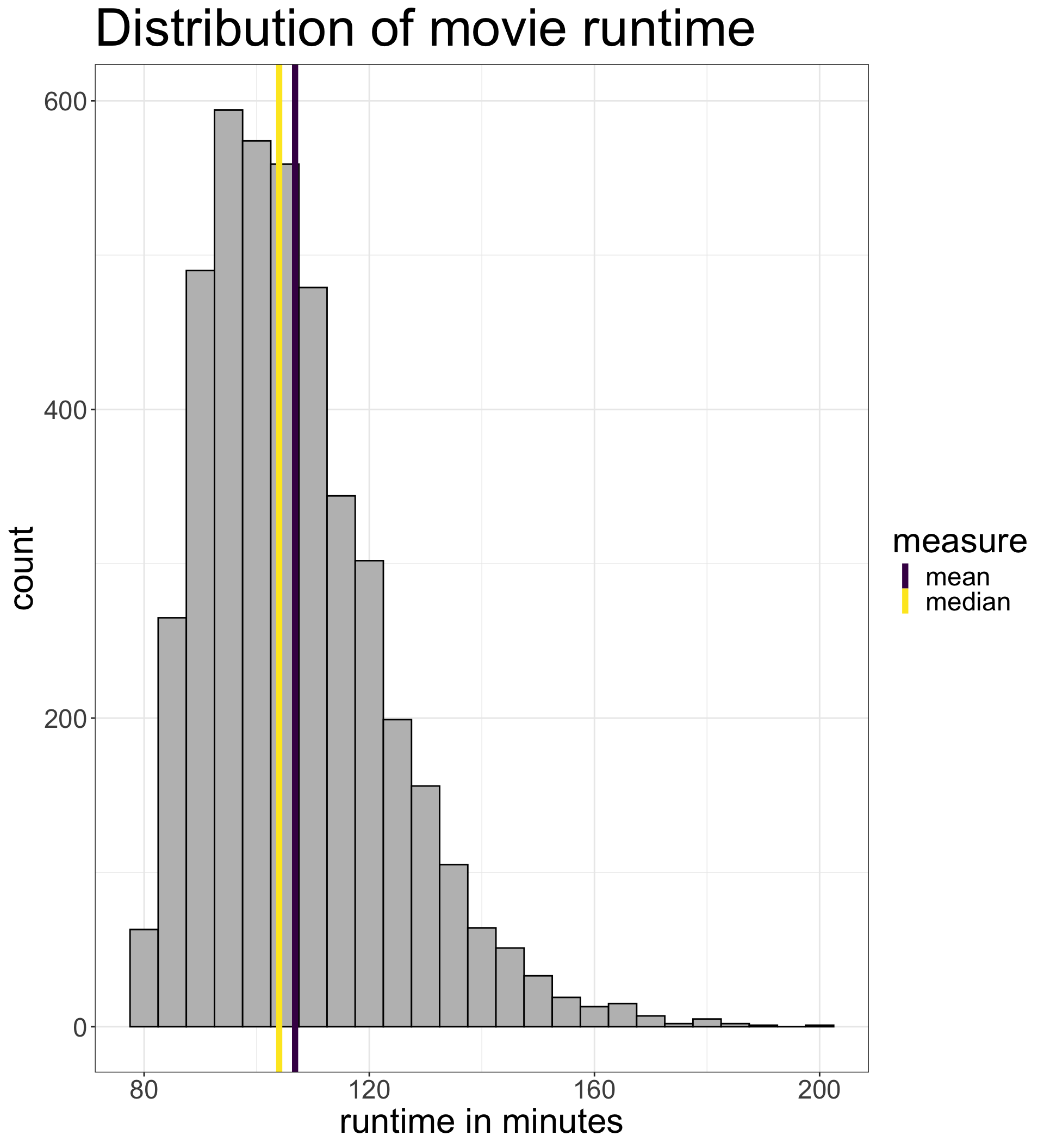
The mean is the balancing point of a distribution. Imagine trying to put a column underneath a histogram so that it does not tip one direction or the other. This balancing point is the mean.

Median

The median is the midpoint of the distribution. At this point, 50% of the observations have lower values, and 50% have higher values.

Mode

The mode is the high point of the distribution, or the peak. It is typically much less useful than the other two measures.

Calculating the mean

The mean (represented mathematically as \(\bar{x}\)) is calculated by taking the sum of the variable divided by the number of observations, or in math speak: \[\bar{x}=\frac{\sum_{i=1}^n x_i}{n}\]

😱 Equations??!!

Don’t panic! We will walk through what these symbols mean.

  • \(x_i\): We use a lower-case letter like \(x\) or \(y\) to refer to a generic variable. The subscript indicates a particular observation. So, \(x_1\) means the value of variable \(x\) for the first observation. The \(x_i\) subscripts means some generic observation’s value of \(x\).
  • \(n\): We use \(n\) to refer generically to the number of observations. So, \(x_n\) gives the value of \(x\) for the last observation.
  • We use the \(\sum (something)\) term to say sum something up. In this case, \(\sum_{i=1}^n x_i\) means to “sum the variable \(x\) from the first observation to the last.”

Calculate the mean in R

\[\bar{x}=\frac{\sum_{i=1}^n x_i}{n}\]

To calculate the mean we just sum up all the values of \(x\) and divide by the number of observations. The sum command will sum up a variable and the nrow command will give us the number of observations, so:

sum(movies$runtime)/nrow(movies)
[1] 106.8222

The mean move runtime is 106.8 minutes.

Alternatively, we could just use the mean command in R: 😎

mean(movies$runtime)
[1] 106.8222

Calculating the median

We just need to sort the observations from smallest to largest and pick the exact middle value of the distribution.

  • If there are an odd number of observations, there will always be an exact midpoint.
  • If we have an even number of observations, we have to take the two values closest to the midpoint and take their mean.
nrow(movies)
[1] 4343

With an odd number of 4343 movies, the exact midpoint is the 2172nd movie. We can use the sort command to sort and then extract the 2172nd movie by using square brackets:
sort(movies$runtime)[2172]
[1] 104

Alternatively, we can use the median command:

median(movies$runtime)
[1] 104

Why are the mean and median different?

  • In perfectly symmetric distributions, the mean and the median will be the same. In other words, the balancing point will be at the midpoint.
  • Skewness will “pull” the mean in the direction of the skew, but not the median. This is because the mean will need to move in that direction to maintain balance.

Skewness can create large differences

Percentiles and the Five-Number Summary

Percentiles/Quantiles

  • A given percentile tells you what percent of the distribution is below that number.
  • We have already seen one example of a percentile: the median. The median is the 50th percentile. 50% of the observations are below this value.
  • Percentiles are sometimes also called quantiles, but I will use the term percentile in this course.

Calculate percentiles in R

The quantile command in R will calculate a given percentile.

To calculate the percentile with this command, we need to add a second argument called probs where we feed in a list of proportions. So if we wanted to calculate the 13th and 76th percentile of movie runtime:

quantile(movies$runtime, probs=c(0.13, 0.76))
13% 76% 
 90 116 

13% of movies are 90 minutes or shorter and 76% of movies are 116 minutes or shorter.

The five-number summary

If I run the quantile command without the probs argument, I get:
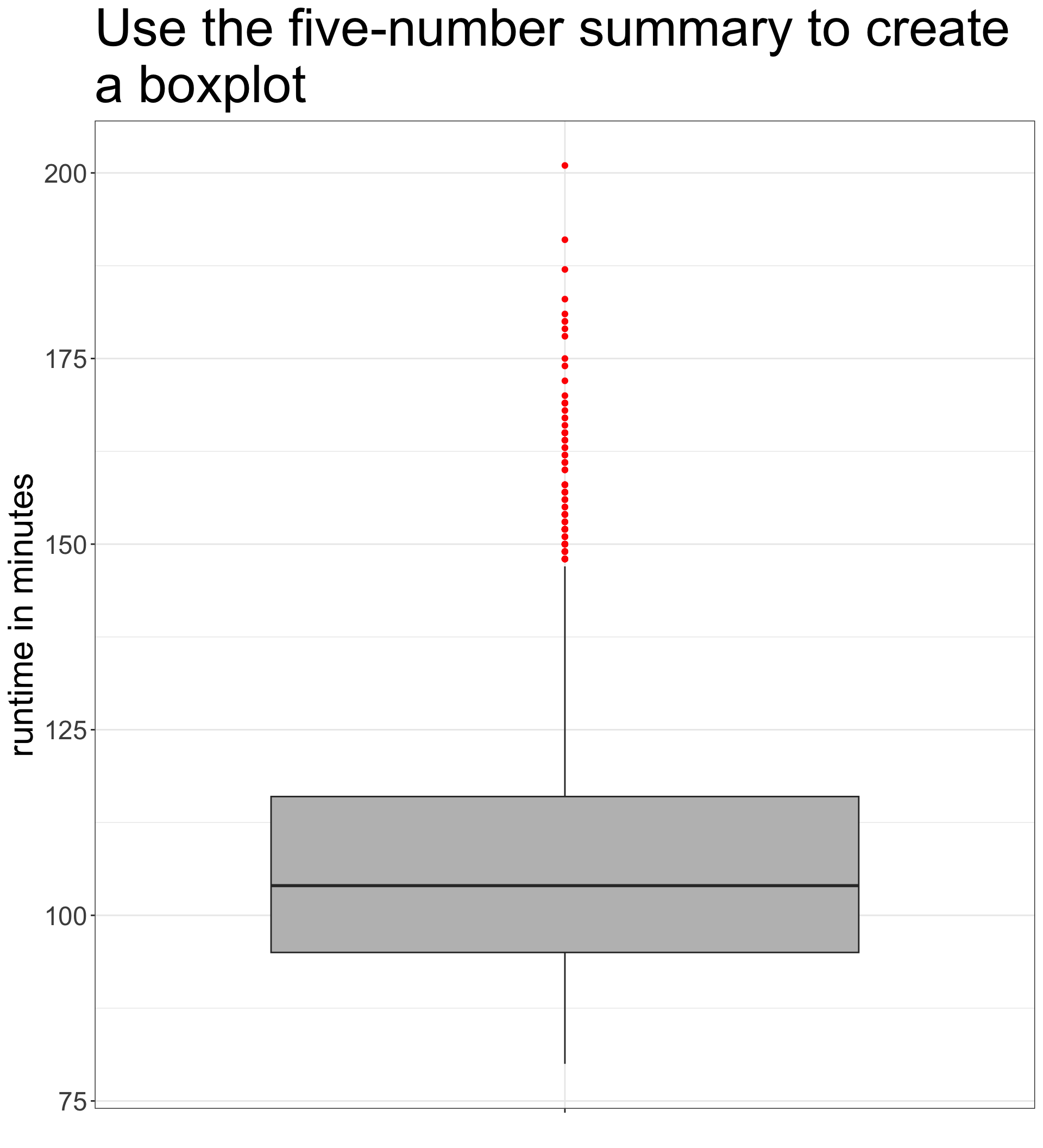
quantile(movies$runtime)
  0%  25%  50%  75% 100% 
  80   95  104  116  201 
  • The 25th percentile, 50th percentile, and 75th percentile are called the quartiles because they split the data into four equal quarters.
  • When combined with the minimum (0%) and maximum (100%), they create the five-number summary.

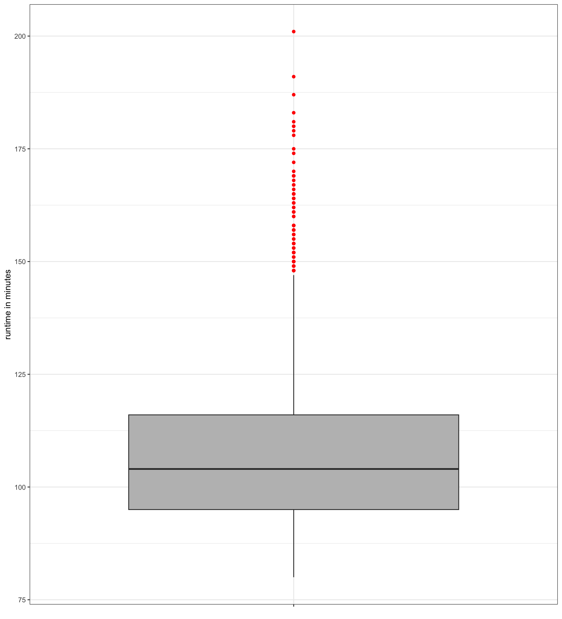
Anatomy of the boxplot

Code and output for boxplot

ggplot(movies, aes(x="", y=runtime))+
  geom_boxplot(fill="grey", outlier.color="red")+
  labs(x=NULL, y="runtime in minutes")+
  theme_bw()

The x="" in the aesthetics is not necessary but does create a nicer looking x axis. Your variable is assigned to y.

You can use fill to determine color of the box and outlier.color to determine color of individual points.
Measuring the Spread of a Distribution

Distributions can vary in their spread

Measures of spread

Interquartile Range

The Interquartile Range (IQR) is the distance between the 25th and 75th percentile. It can be calculated by the IQR command in R:

IQR(movies$runtime)
[1] 21

The 75th percentile of movie runtime is 21 minutes longer than the 25th percentile.

Variance and Standard Deviation

Standard deviation (SD) is the most common measure of spread in a variable. Loosely, standard deviation measures the average distance from the mean of all observations. Variance is the squared value of standard deviation.

Calculating the standard deviation

The standard deviation \((s)\) is calculated with the following formula:

\[s=\sqrt{\frac{\sum_{i=1}^n(x_i-\bar{x})^2}{n-1}}\]

😮 More Equations??!!

Don’t panic! We will go through it one step at a time.

\((x_i-\bar{x})\): The distance between each observation’s value and the mean. Some of these values are positive and some are negative. If we summed these values up across all observations, the sum would equal zero by definition.

distance <- movies$runtime-mean(movies$runtime) 

\((x_i-\bar{x})^2\): We square this distance to get rid of the negative values.

distance_sq <- distance^2

Calculating the standard deviation

\(\sum_{i=1}^n(x_i-\bar{x})^2\): The sum of the squared distance, sometimes abbreviated SSX.

ssx <- sum(distance_sq)

\(\sum_{i=1}^n(x_i-\bar{x})^2/(n-1)\): Dividing through by the number of observations gives us the “average” squared distance from the mean. This number is the variance.

variance <- ssx/(nrow(movies)-1)

\(\sqrt{\sum_{i=1}^n(x_i-\bar{x})^2/(n-1)}\): We square root to get back to distance.

sd <- sqrt(variance)
sd
[1] 16.3027

The average movie is about 16.3 minutes away from the mean movie runtime.

We can also just use the sd command: 😎

sd(movies$runtime)
[1] 16.3027